Art, Economics, and the Accessibility of Data: Interview with Asin Fathima Allavudeen
Share
Art and economics. At first, you may think that those two fields are completely different from one another. But as it turns out, they share more similarities you would expect. On February 28th at 1 p.m., I had the pleasure of attending a workshop hosted by Asin Fathima Allavudeen ‘27 at the Georgetown Art Center. Through her workshop, I learned not only about how economics and art can work together, but how it can highlight the accessibility, or inaccessibility, of giving data. After attending her workshop, I interviewed Asin about her work and how she orchestrated her whole project together.
Make sure to check out Asin’s next workshop on March 8th at the Georgetown Public Library from 2-3:30 p.m.!
Can you give us a brief description of what your project is?
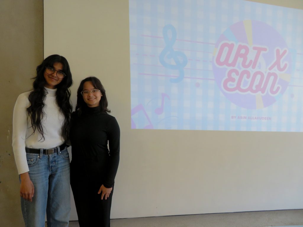
My project explores how economic data can be experienced instead of traditional graphs and charts and predominantly uses sound technology and sensory translation. My research is specifically focused on data sonification as the alternative way of communicating economic information and data. Instead of treating data as something purely visual, numerical, or graphical, my core questions are: what happens when we hear data? Who gets excluded when only visual communication of economic data takes precedence? What are alternative ways of expressing data?
How long have you been working on this? What was the timeline between finding your idea and planning on it?
The idea came to me during the Spring semester of my second year. What I wanted to do was research the project with my professor over the summer break. Unfortunately, the deadline had already passed when the idea came. But I was still caught up with this idea all summer and I was so gravitated towards the intersectionality between 3 completely different fields: economics, art, and music. Surprisingly, there is also psychology as a connecting factor that correlates these fields with each other. I wanted to see what this idea could look like and turn this into a real thing.
When I talk to my friends and family about my idea, although supportive, they were really confused and thought it was bizarre. However, it only reinforced my idea and it made me realize for someone so accustomed to the conventional way of interpreting data, this project would obviously be unconventional. Alternatively, for someone who explores the world only through sound, this may not be immediately surprising, but can be of tremendous help toward them.
What led you to working on this project? What inspired you?
I was having a conversation with my sister, and in the conversation I was telling her how much I loved studying economics. I told her that all the charts and graphs were so fun to me. But my sister disagreed, she felt the complete opposite. So I asked why. She said, “the graphs and charts are just so daunting, so dry, and they have no sense of depth that made her enjoy it.” I then asked her what would make you enjoy it. Jokingly, I said if I expressed the data through sound, would you enjoy it? She answered, “I think I might, but I would have to listen to it first.”
I then felt 2 things: the data was not reaching her, and I was brought upon a challenge to make the data reach her. At that moment, the artistic lens helps bring to mind the existence. What I, at first, said as a joke, “what if I put data through sound?” became a true question. So I started to actually work on it. How can economic data be translated into multisensory experiences in ways that expand accessibility and deepen interpretation beyond traditional visional graphs?
What was your goal while working on this project?
The goal wasn’t to replace graphs, but rather add-on and expand how we engage economic information so it is more inclusive. Much of it is still experimentation right now, even though I did the workshop to see what I hope to be the outcome is not delusional and that people can tell me if it’s factual or not. It’s important to me not to confirm if my work is useful, but it’s more if it’s not useful; that way I can tilt my work in a way that will become useful progressing forward. My ultimate goal is to find ways of making economics an accessible language. As an artist, I think this is a good place to invest my time on creating those alternative ways. I want to challenge the assumption that data must be in a specific way to be legitimate.
Since you’re a studio art and economics double major, how have your classes helped you build your project?
In a lot of art classes, you are constantly taught to look at the gaps. And if you identify a gap, as an artist, you might have some role to help fill that empty space with something meaningful. In economics too, it’s not very economical to find a problem and not do anything about it. In my behavioral economics class, we particularly loom over and study the biases humans have and experience. One of the studies we looked at was the status quo bias, which is the natural tendency to want to stick to the default option that’s immediately available to you.
I found it deeply troublesome, because if people only choose to take what’s given, then we can never explore beyond what we can have otherwise. I am a firm believer of providing people with options, and when we convert data into sound and present that as a language of its own, like visual graphs and charts are, we can provide people with options. It’s important for me because that is what I would want too—the ability to freely make choices.
You created a workshop at the Georgetown Art Center; why did you want to create a public workshop?
While I was in an independent study class, I wanted some funding to get to the bottom of this project. At the same time, there was a possibility of applying for funding for the King Creativity Fund, and surprisingly, I got accepted. From there on, I had the opportunity to further explore this work beyond the independent study itself. For this reason, I set a goal of achieving tangible outcomes that would culminate all the work I’ve done thus far. As a result, I arrived at the possibility of doing workshops, and also creating a website to allow users to be able to do the thing I envisioned.
During the winter break, I was considering some places where I can conduct the workshop. It could’ve been on Southwestern campus, but I wanted to hold it off until I can meet other winning recipients at the King Creativity Annual Symposium. I wanted to see if I could go outside Southwestern and see if I could reach a wider audience. I was looking around but I liked looking to host specifically at Georgetown Art Center because I like the idea of approaching this idea from an artistic standpoint first before anything else.
How did you plan for your workshop so people can learn and understand?
I have a personal philosophy that people understand best when they experience the thing first-hand. And that is what I tried to keep as the foundation for my workshop. I wanted this to be as experiential, interactive, and immersive as possible. My goal for the workshop would be that people would have the opportunity to understand how they perceive the world around them through their senses. All I needed to do was build a workshop leading towards that goal. To do this, I began with thinking about how tactility can be explored.
I came up with an exercise where I placed 6 different objects with 6 distinct textures, and asked the participants to feel the texture of each object, and come up with adjectives describing the object as they interpreted. I then asked each individual to say one adjective they picked with the rule that nobody could repeat what previous people have said. At the end of this exercise, I then presented them with a simple truth: although we were collectively describing the same object, we all came up with different interpretations. The object itself did not change, only our sensory and linguistic frameworks did.
The differences do not make one interpretation inherently false. They simply reveal that meaning is shaped by perspective. This is how I view economics to function too. The underlying data may remain constant, but the way it is translated, framed, and represented shapes how it is understood. When one mode of representation is treated as the sole authoritative truth, it runs the risk of obscuring the interpretive frameworks behind it.
You got your friend, Virginia “Gigi” Williams ‘27, to help you at the workshop, how did she contribute?
Ever since I started thinking about the workshop, I wanted an actual instrumentalist to play an instrument to translate whatever data I wanted. When I worked with Reeha Rauf ‘25, an alumni, she helped me build my website (which you are free to explore). I wanted the website to have a feature where the data is converted through sound through data sonification. When we were building it, we also wanted a specific feature that would convert sonified data sets into musical scores for musicians to play at some point.
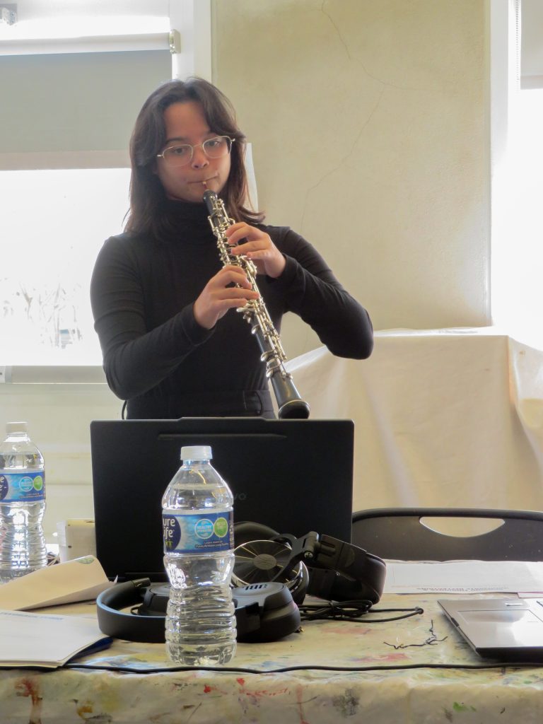
Gigi is an incredible friend of mine, and I knew she plays the oboe really well. For a compact space like the Georgetown Art Center, it just made sense to invite her to play. So I reached out and she was totally excited to be a part of it and up to the challenge. There was a problem with the musical score; for whatever reason, the website was not doing a good enough job to convert the data into a musical score. Some notes were too low and would only work for instruments like a piano, which has a wider range. So Gigi came up with the solution where we can transpose the notes and make it suitable for instruments like the oboe. This worked well because changing the octaves did not change the data itself and conveyed the same information.
How did you convey the economic data through music towards the audience?
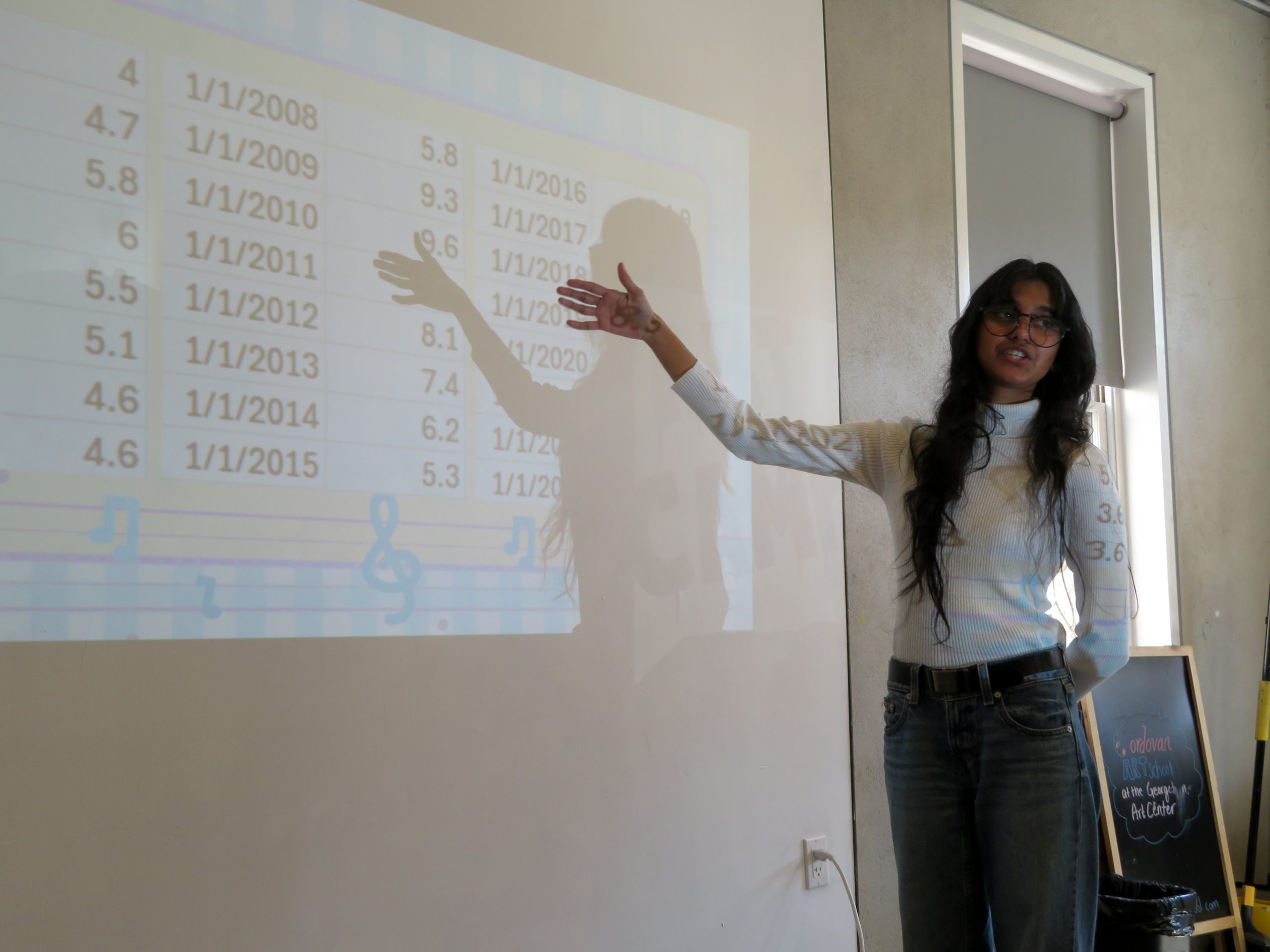
The first time Gigi played the musical score at the workshop, I had not yet revealed what Gigi was exactly playing. I posed a question about what the musical score could’ve been. Someone said it reminded them of code, someone else said that it felt like a roller coaster with the rise and fall of octaves. I then asked Gigi to play the same piece once more, but before she played, I revealed that the musical score had an underlying data set of the unemployment rates from 2000-2024. I then asked the audience to see if that information alters their interpretation of the music itself going into their second listen.
The third time Gigi played, I presented a numeric data set for the audience to see and asked them to see if the music makes sense now that they had numbers in front of them. As a result, I pointed to the fact that they didn’t even need the numeric data to determine when the data is going up or down from the music. Next, I had Gigi play the same music 3 times in a row and asked the participants to simultaneously try translating however they interpreted that music onto a colored paper as designs, with only a sharpie. The sharpie was necessary because I would later introduce more art materials so that they can feel the lack of material constraint versus the freedom of choosing which tool they want to express themselves through.
By the end of the exercise, I pointed towards an interesting truth. What they had essentially come up with was basically a graph; except one is bound by rules and the other was made through very personalized interpretations of how they view the data and understand it to be. Surely nobody else could read it, or even themselves for that matter, but it would be the truest reflection of what the sonified data set made them feel. Like a memory captured in time, it’s a feeling captured in design.
You also had audio sets prepared for the audience, how did they convey your message?
We listened to other data sets, such as inflation, and 2 prerecorded audio of data sets: GDP and unemployment, and inflation and money supply, in which both economic indicators were juxtapositioned and played together. The purpose of that combination was to see if the way two economic indicators behave can be captured and conveyed well through two distinct instruments. The next audio was GDP and money supply combined, which got a lot of reactions, with comments from the audience saying it’s calming and peaceful, while others said it feels ominous and suspenseful.
Unconventional to the previous data sonifications, I lastly introduce an audio that was manipulated to have crow cawing noises, with pitched variation for every unit of crow cawing. This arguably brought the most reactions from the audience because it was so loud, disruptive, and unusual. However, this was very intentional and integral to the design of the workshop itself. I made sure to narrate and lead it to reach this point so I can ask the questions: Why does data feel correct only when presented in certain formats? Who decides what a “legitimate” data representation looks like? I then posed another possibility; What about data representation through the other senses? What would it mean to treat sound, touch, smell, or taste as valid data translations?
We understand charts and graphs because we understand the rules behind them. So if we were to create concrete rules to the other senses too, then we can create systems that convey the same thing, but in different formats. Why are we expected to accommodate data, rather than data being designed to accommodate us? This is why I think it’s a design problem, as opposed to an intellectual problem. When the proper tools are not provided, it’s not surprising we become limited in our abilities. As an artist, it makes the most sense to contribute to creating those tools.
What was the result of this project through this workshop?
The result was personal understanding. It was merely an opportunity to explore how each of us differ in our interpretations, yet combine when it comes to conventions. I want people to become aware of the moments they take for granted the tools that are available to them; people with visual impairment, dyscalculia, dyslexia, and other intellectual disabilities don’t often have many options to begin with. I wanted to convey the necessity of acknowledging the fact that a field so expansive as economics may not be as inclusive as it could be otherwise.
What did you learn about yourself while working on this project?
I’m a very ambitious thinker, however, that ambition is what drives me to bring the vision into reality and actualize it. I don’t want to be bound by any constraint in my capability in approaching things creatively. I live by the idea that any aspect of life itself is deeply intersectional in nature. That notion constantly drives me to perceive, analyze, and explore how connections happen and creativity could flourish. I’m an artist, but before that, I’m simply a person who wants to point and lead towards the possibility of some kind of tangible change taking place.